Works That Work
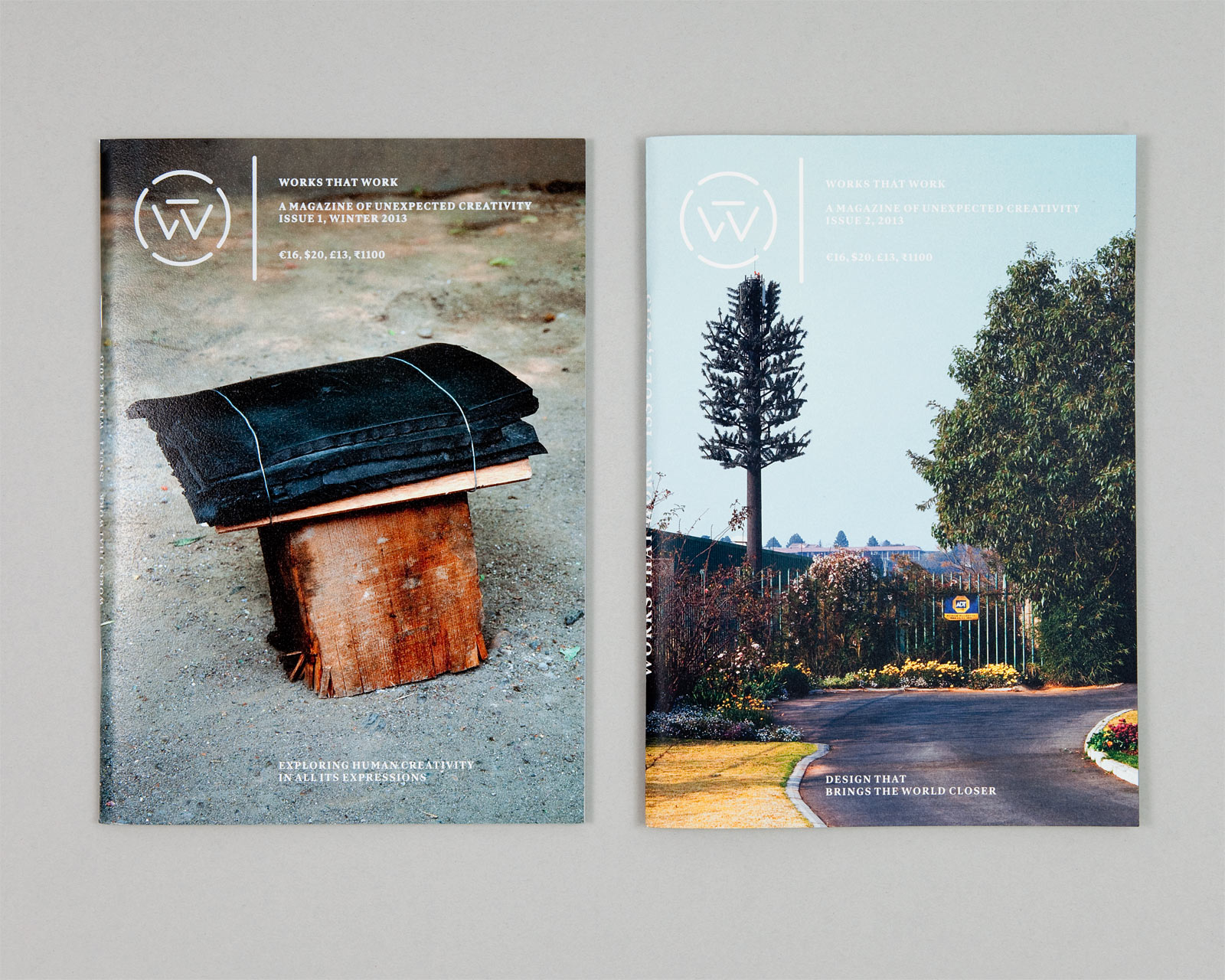
Works that Work is a magazine for the curious, a design magazine for everyone. Instead of portfolios and case studies, it tells of unlikely and surprising creative accomplishments. It’s about stories “that make great dinner stories to tell your friends”, as the magazine’s editor and founder Peter Biľak puts it. But we also found it interesting that the magazine addresses topics that designers may relate to, or find inspiration in, while extending their view of what design can be.
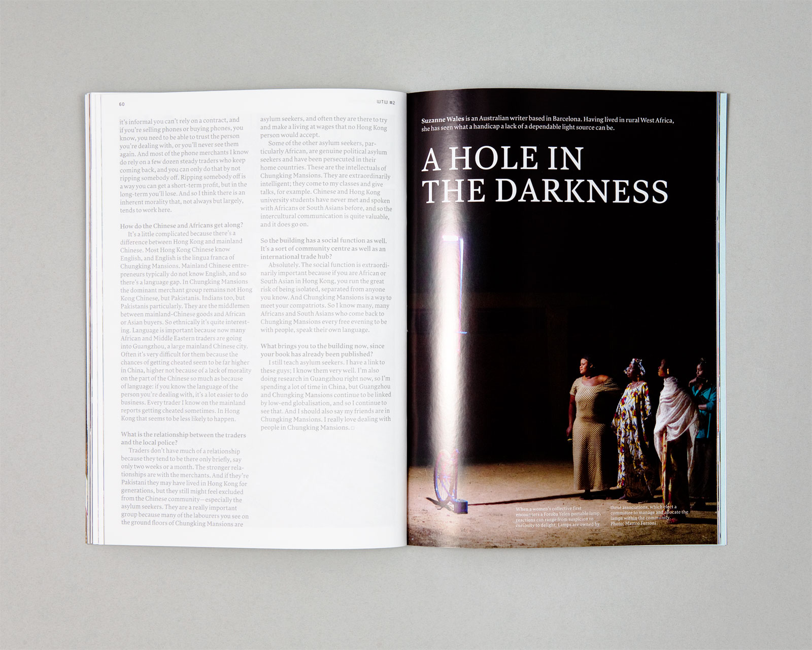
When Peter asked us to design the magazine, the brief was to use an economic format (17×24 cm) and to expect around 80 pages. Because of the shipping costs, the magazine could not weigh more than 250g including an envelope. In order to open nicely and not look too precious, it should be stapled. Peter had already designed a logo, and the main typeface for the magazine, Lava. Most importantly, Peter asked that the magazine’s form reflect its content.
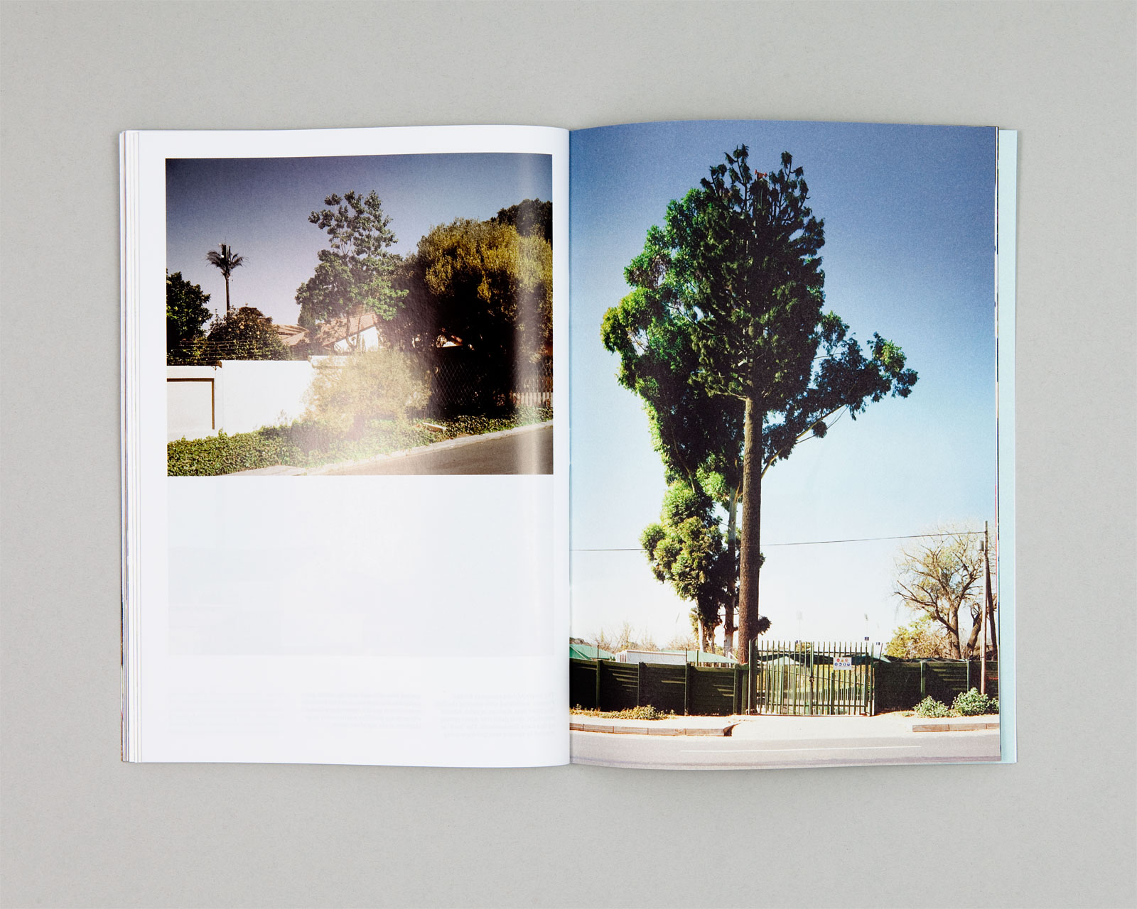
The last bit was just what we had hoped to hear, and the rest made it an interesting and quite unexpected project. Looking at the content, we noticed two important properties about it that would influence the art direction. Firstly, not many of the subjects that the magazine would report on are extremely topical – some things may already exist for years, decades (or in one case, for more than 1400 years). And secondly, while some photography is stunning, there are also always a few pictures that are just illustrations that support the text.
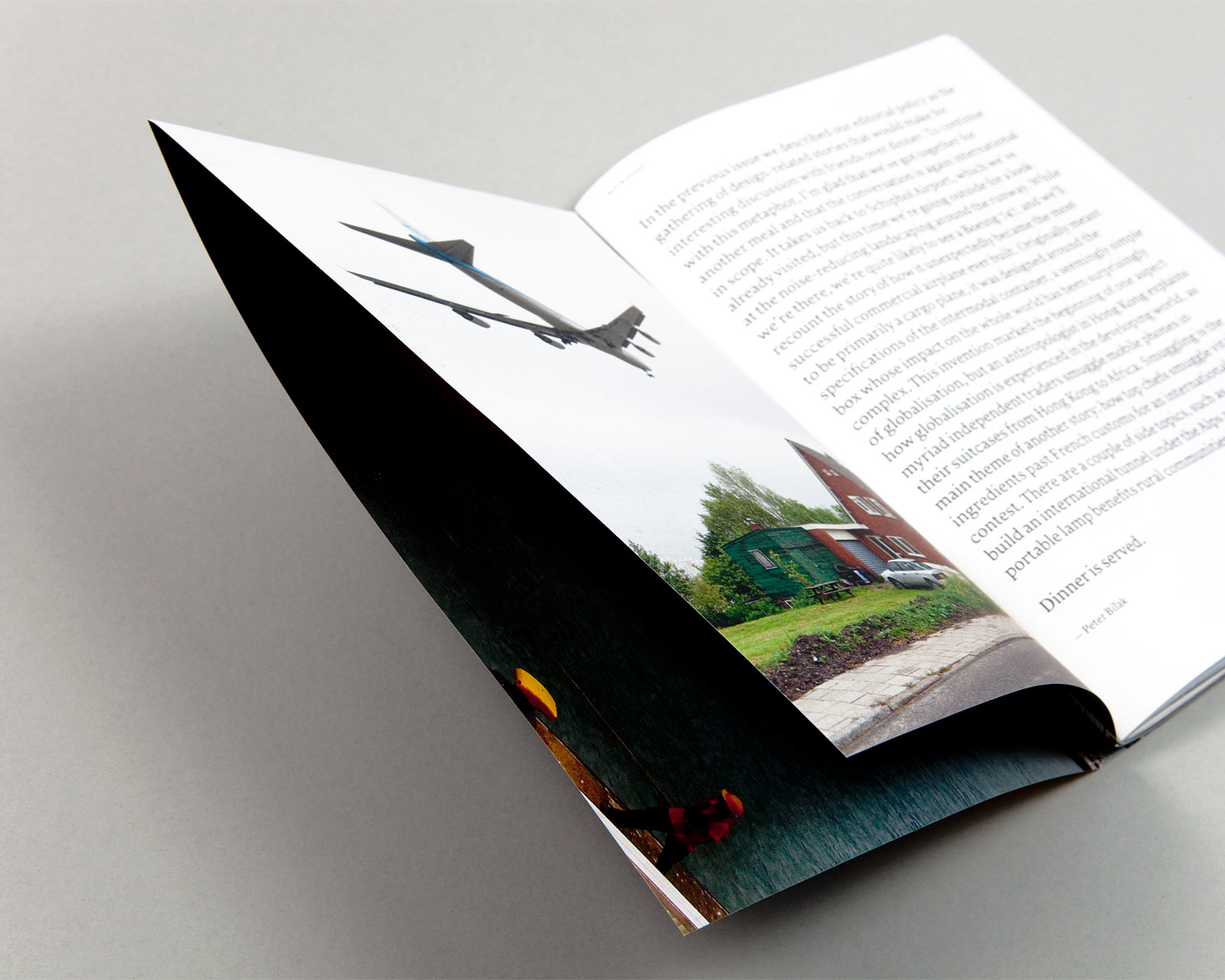
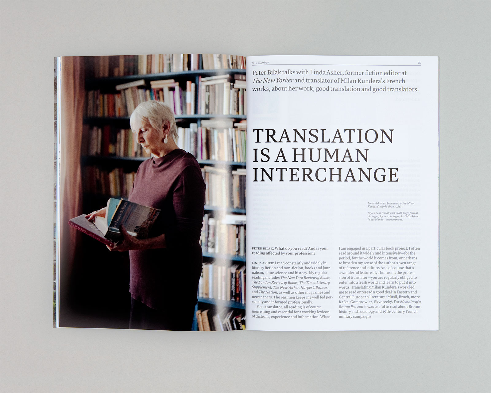
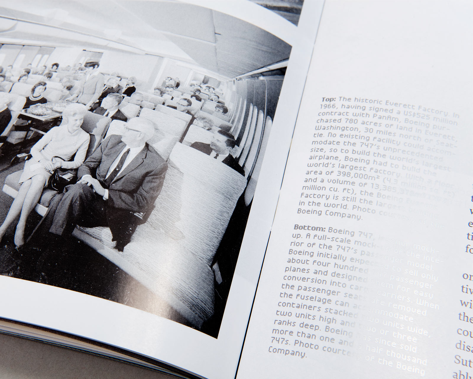
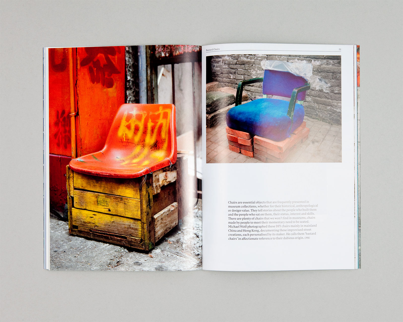
We came up with a design structure that could both be urgent and news-like, but also accommodate lavish photo series. A formal expression that would be matter-of-fact if it needed to be, and personable if it could afford to be. We accomplished that with structured headline-sets, all-caps titles and a limited layout language for text. At the same time, we designed many options for opening spreads and for using photography very dominantly or discreetly as footnotes.
For Peter Biľak, The Hague, 2013, ongoing.
17×24 cm.
Related